Dev Diary - 3/3/20 - Haulin’ Oats And The Dope Game Remaster
Hey there! So the dev diary is a day late this week; kind of spaced it with all the different things going on. That being said, let’s dig into what’s new.
Haulin’ Oats Status
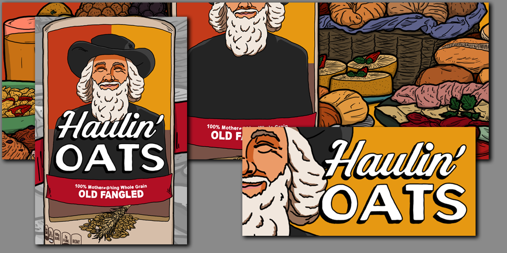
More progress on the Steam setup. All of the header, capsules, and additional assets have been created and entered, both for the store page and community. During that process the main title got a little update with modifications to the font and a darker drop shadow added.

Statistics and achievements were all entered with quite a few of the achievements showing the specific progress towards obtaining them. All depots have been set up and are ready to be filled. Even though alpha v0.0.1 is buggy, it is added as a placeholder for v0.0.2.
The store page still need finishing and trading cards will be added at the very end right before launch.

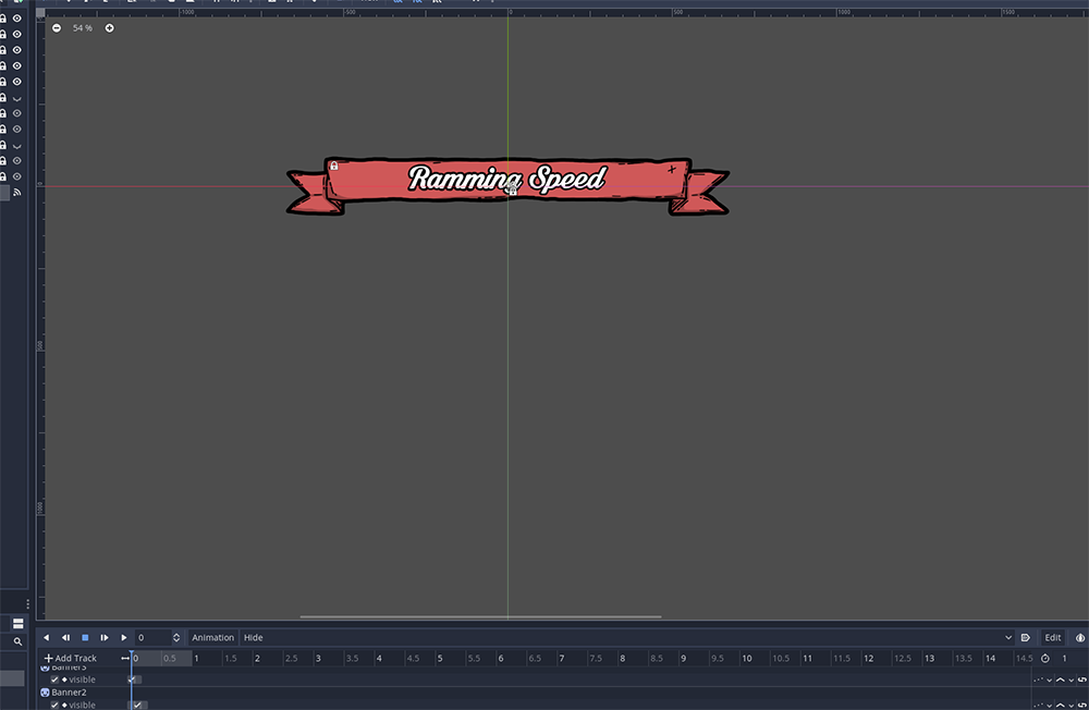
As far as the game itself is concerned, I am still plugging away at getting all the new square animations rigged and the underline square code updated. Most of it is the same but the there are now instanced scenes for the banner and text backing so they can be animated and reduce the code-base per square.
Hopefully all the square will be updated to the new system this week and move on to the last few bits before getting alpha v0.0.2 shipped out!
The Dope Game Remaster
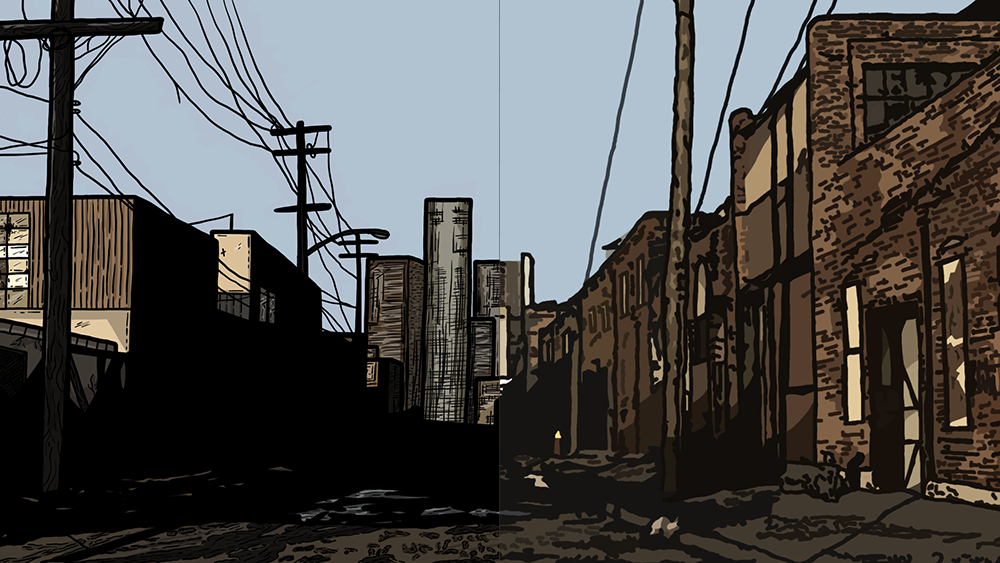
This week was a lot of drawing. Pretty much only drawing actually. Recreating all the background environments is quite the undertaking; especially since they are more detailed.

The shot above is of Crockfort / the main title screen and you can see the pretty significant changes that have been made.
Also the character avatars have been dropped due to the way the new dialog window is set up. The avatars, however, are still being re-drawn and will be added to the credits page next to the names of the people who played those characters.

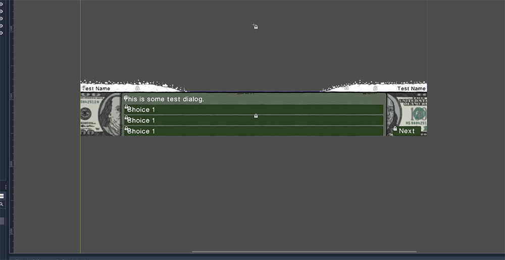
The face-lift for the dialog interface will have a line of coke that slides into frame based on who is actually talking. Granted the player mostly just picks a response choice. Here we see what the full interface looks like with all the test data in place. Pretty fancy compared to the original.
That’s about it for this week. See you next week for more updates!
Haulin' Oats - Demo
A board game about truck driving, the US highways, and oatmeal.
| Status | In development |
| Author | CoaguCo Industries |
| Genre | Strategy |
| Tags | 2D, Board Game, Comedy, Dogs, Hand-drawn, Multiplayer, Singleplayer, weird |
| Languages | English |
More posts
- Haulin' Oats - Itch Page And DemoMar 29, 2023
- Haulin' Oats - Eary Access v0.3.2Mar 15, 2023
- Haulin' Oats - Early Access v0.3.1 - Escape From Soft-Lock CityMar 10, 2023
- Haulin' Oats - Early Access v0.3 - Steam ReleaseMar 10, 2023
- Haulin' Oats - Early Access v0.2.3 - Itch.io ReleaseMar 03, 2023
- Haulin' Oats - Early Access v0.2.2 And Slight DelayFeb 23, 2023
- Ooooh boy! Back-dating posts!Feb 22, 2023
- Haulin' Oats - Beta Version 0.1.0Feb 22, 2023
- Haulin' Oats - Beta Version 0.1.1 UpdateFeb 22, 2023
- Haulin' Oats - Beta Version 0.2.0Feb 22, 2023

Leave a comment
Log in with itch.io to leave a comment.